This is my final product.
https://drive.google.com/file/d/1Y3eZqJGEE97F5SoSQPeJOtQwnt2RFSyH/view?usp=sharing
This is my final product.
Here is my creative critical reflection for question 1.
Here is my creative critical reflection for question 2.

https://drive.google.com/file/d/1e76Vg8Gz8gVehyCqXbmbDHLShuB-StxI/view?usp=sharing
Here is a link to my poster incase the picture is blurry -
https://www.canva.com/design/DAGhcpzZaXU/Co9L7LmkWzAls4w1Xr2QKA/edit?utm_content=DAGhcpzZaXU&utm_campaign=designshare&utm_medium=link2&utm_source=sharebutton
Here is my creative critical reflection to question 3.

https://docs.google.com/drawings/d/1484ma4_n9CmXZQ-byZtYpqDDPeyztikdDozRYbNr_08/edit?usp=sharing
Here is my creative critical reflection to question 4.

Here is a link to my CCR4 incase the picture is blurry -
https://docs.google.com/drawings/d/1t-tR4LJ3dgO5gyF1mAePq6b4V4ONCMLJ_sXMvNUJTEE/edit?usp=sharing
This post explains how we showed a rough draft of our film opening to some members of our target audience in order to receive helpful feedback. This blog was made by Maisie.
The purpose of a screen test is to gain audience feedback about our work and see if there are any improvements that can be made. We decided to use Google Forms to create a survey to share with our audience because it is very quick and easy to use for both me and the respondents.
Questions:
1. What do you like about the video?
2. What improvements can be made?
3. What do you think of the effects so far? (sound, lighting, coloring, etc.)
4. If you rate it low, how do you think we can improve?
5. Mention 3 words to describe the cursed book.
6. Mention 3 words to describe Drew (the boy).
7. Would you watch the rest of the movie?
8. Which title is better?
Evaluation:
We specifically chose these questions because we want to make sure that all of the elements and techniques we chose to implement into our opening scene successfully reaches and affects the audience correctly. At the same time, we are also making room for improvements by directly giving the respondents the freedom to express their opinions and thoughts. Furthermore, we chose these questions to further understand the extent of how immersed our respondents feel while watching the video, as it is one of our main goals (to make the audience feel like they're a part of the events).
We showed the clip to three members of our target audience to ensure that the feedback we receive is appropriate. Finding people for the screen test was easy, because we used social media (Instagram story) to spread the word and ask for volunteers. Thankfully, due to how quick social media connects us with other people, we got three different volunteers to help us out in no time.
Draft:


This blog post contains research on a bunch of typefaces and title ideas for our movie opening scene project. This blog post was done by my team member, Kristine.
These are some examples that I liked
1. [⏺REC]

I liked this idea because the font and style stands out from other found footage titles, making it a unique feature. The idea of using the red dot and bracket helps convey that the movie is related to a recording, signaling to audience that it is a found footage film. In the second version, blood splatters suggest audiences that the movie may context murder, death or gory scenes. However for this title card, it was seen at the end of the film. This was because the filmmaker still wanted to maintain the realism and managing to incorporated the title card.
2. The Blair Witch Project

3. GRAVE ENCOUNTERS

4. CLOVERFIELD

5. Spree

What credits / names will you include
Starring: Actors
- Drew: Panji Wiradharma
- Carrie: Kellie Collins
- Lyla: Lamiya Zara
Editor: Maisie Halomoan
Directed: Kristine Lambert
Found footage films often don't include opening credits to keep the feeling of realism. Since we wanted to keep that same style, we chose not to include any credits at the start. Doing so would break the immersion and make it feel less authentic
10 Typeface Choices
credits: dafont.com, capcut fonts

Discuss Connotations
VCR
What I like about this font:
- It's a typical found footage font, which aligns well with the genre conventions. We could use it to stay true to the found footage style.
What I dislike about this font:
- The font looks too digital. Our goal is to make the film feel realistic, not technologically advanced. We don't want to incorporate too much technology, as it could break the illusion of realism
How it will look like in our product (brief idea)

What I like about this font:
- This font is commonly used in found footage films because it looks handwritten. This gives the impression that it was made and meant to be "found", which fits the genre
What I dislike about this font:
- The font appears too old for a modern found footage film, so it doesn't logically connect with the setting or time period (2019). It feels out of place. On its won, the found looks strange and may require vintage filters to bring out the desired realism. Without those, it could disrupt the overall authenticity.
How it will look like in our product (brief idea)

Experiment
Here are quick experimental pictures that I did to get a better look on how each font would look like

Title Ideas

Opening Text Ideas

Reflection
My team member, Kristine, did a great job looking at a variety of different types of fonts. My team and I now have a better idea of which one we will use and why it's best for our film, considering the genre that we have chosen.
This blog post contains the technology and apps that my team and I used to complete our filming project.
Tech/apps used:
Our main form of communication was through WhatsApp. We talked about props, costumes, filming dates, times and the location for our shoot in a group chat that Kristine made.


- Camera app
Since our project genre is horror (found footage), we used our camera app on our iPhone's instead of an advanced camera because we wanted the film to look very realistic and a bit unclear. The film is meant to make the audience feel uneasy and scared, so with low quality footage and filters that will be added later on in the editing process, this will help create that tone.


- Photos app & shared album
Since we were using our phones to film, we had a limited amount of storage to use. To fix this problem and help fasten the process of sharing all of our footage and behind the scenes pictures later on, Maisie created a shared album in the photos app. This allowed us to have one place where we can view and keep adding in new files throughout the filming day.


- CapCut
The app that our editor, Maisie, has decided to use is CapCut. It has a lot of helpful templates, filters and effects on it. Maisie is also familiar with it and has used it before, so this will help make the editing process a lot easier for her.


- Google Docs
A large part of our planning work was done on Google Docs, we used it for our script writing, filming schedule, statement of intent, location scout, risk assessment and our dominant reading. Not only does my group and I find it useful and convenient, but we do a lot of our work in class using this app.


- Google form
A part of our blogposts was to receive audience feedback, we decided to create a google form because we thought it would be the easiest way to collect it.


Reflection:
Creating this blog post was fairly easy. All of these apps were extremely useful with completing this project, especially because my group and I are already very familiar with them. It allowed us to have good communication throughout our filming schedule and made the process easier because we already had everything downloaded on our phones.


After getting the clips from my team member (Maisie), I've decided to help with the glitch effects. I used an app called Video Star because it offers better features and more realistic effects than CapCut. Although the effects I will be using are paid, I have been using this application and its paid version since 2018. This application is only available on mobile phones so I had to edit the footage on my phone.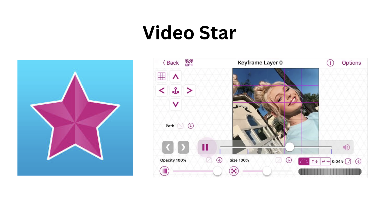
First I will introduce you the 3 youtube videos that I've used for sound effects and glitches.


